Calm & Collected
Land Park home has mid-century style without the kitsch
By Cathryn Rakich
September 2020
Layers. That’s how Renée Carter described her Land Park home when she purchased the mid-century-style abode in 2007.
“Over the years there were layers,” Carter says. “It obviously went through several phases of homeowners trying to make it into something it wasn’t.
“There was a layer of Asian influence. Then someone did Tuscan-textured moldings.” The floors were covered in white Berber carpet. “When you came in, you had to see past all of that—and see the bones—the beautiful openness and all the light coming in.”
Before Carter, who owns a Downtown technology consulting business, embarked on remodeling the 2,500-sqaure-foot home built in 1962, she obtained the original plans from the city. Carter learned the two-story home was built by renowned Sacramento developer Robert Powell, who created Pavilions Shopping Center, Campus Commons, Gold River and other high-end developments. Powell also built thousands of local residences from the 1960s to 2007.
“I wasn’t trying to go back to a purist mid-century modern look,” Carter says. “I wanted it to be more classic modern so it would stand the test of time.” She also did not want a “kitschy” look. “There is no orange in this house.”
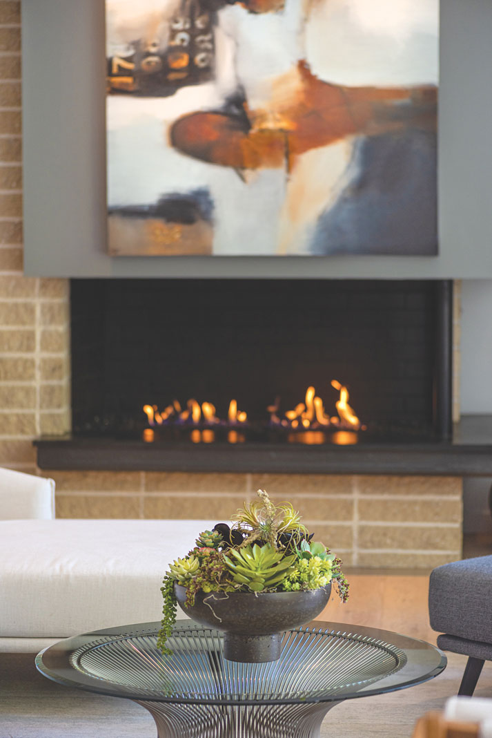
To get started, Carter ripped out the Berber carpet, replaced the carpeting on the second floor, scrapped the moldings and smoothed the wall texture. “The fireplace had a sloping design—which was original—so I squared that off to give it a more classic modern look.”
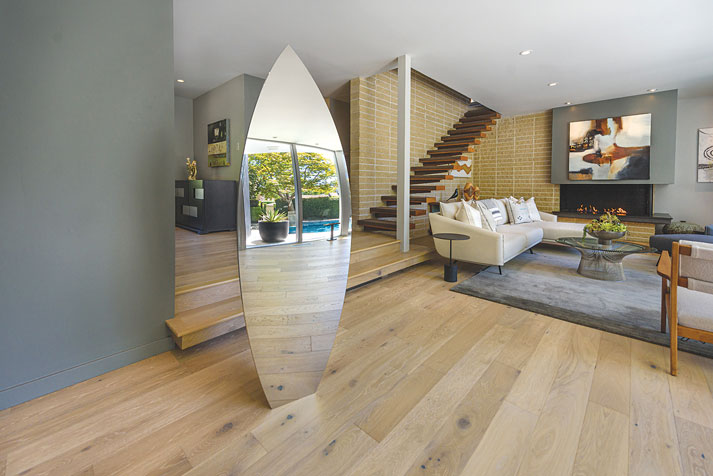
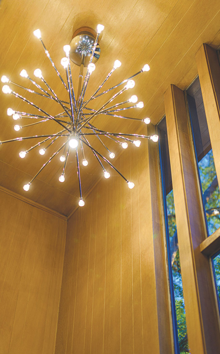
A massive 15-foot-high front door leads into the original wood-paneled entryway accented by four elongated windows. The living room features an impressive wall of nearly floor-to-ceiling windows with a sliding glass door to the front yard.
“I purposely don’t have a television in here,” Carter says. “This is a place for good conversation. You can open everything up and it’s really lovely.”
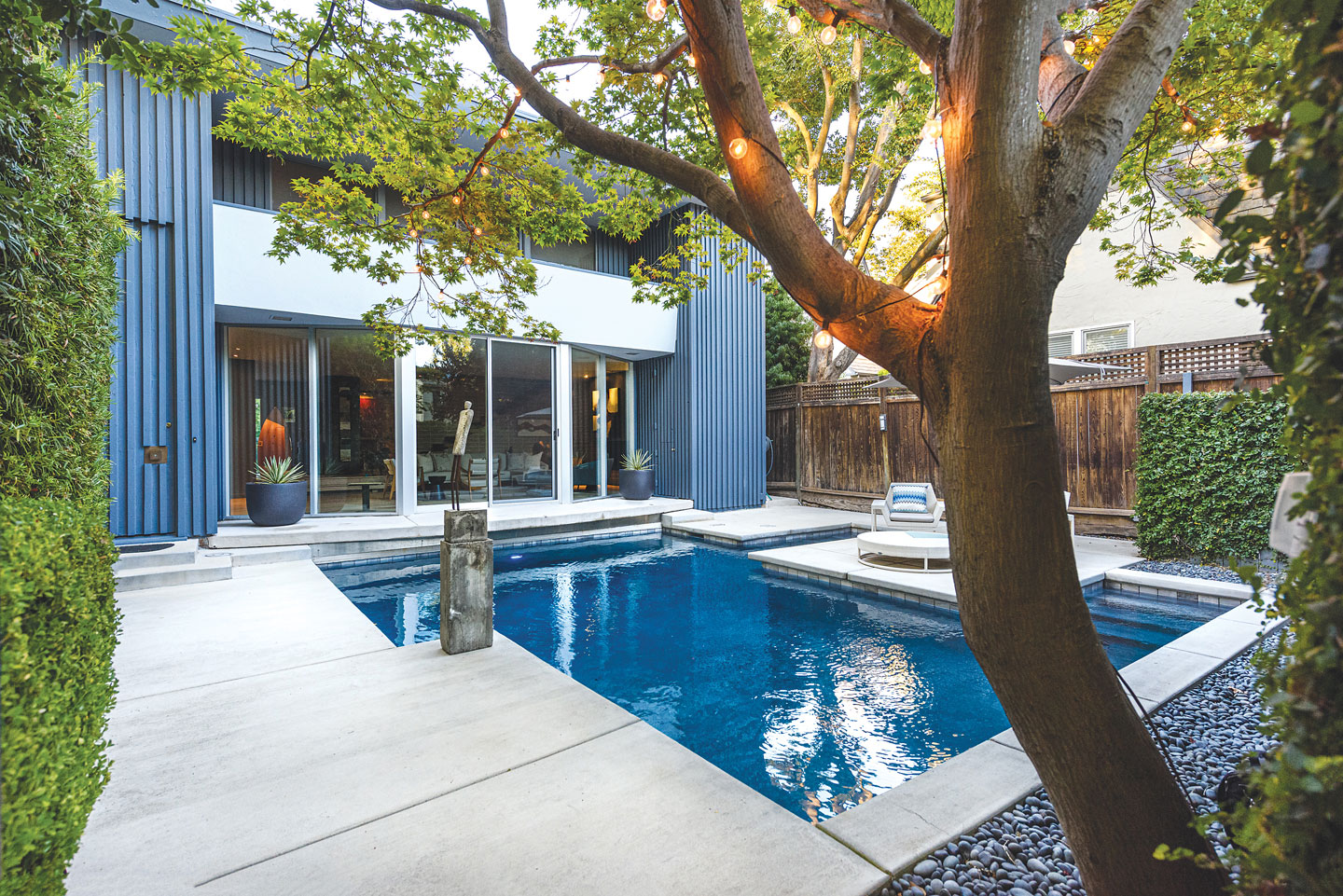
Beyond the large living room windows is a front-yard swimming pool, a component of the original design. “It’s part of the ambiance of being in this room. It’s really relaxing to look out at water,” she says. At night, the pool lights up with “a beautiful Tahoe blue illumination.”
Part of the home’s charm is a small bar adjacent to the fireplace and next to a Dutch door—the top half swings open to the front yard. “I guess you can hand cocktails out to people swimming,” Carter laughs.
Scattered throughout the home is original artwork, including a polished stainless-steel sculpture by Sacramento artist Marc Foster. “When you are sitting in living room, the other art is reflected in it,” says Carter, who sits on the board of the Verge Center for the Arts.
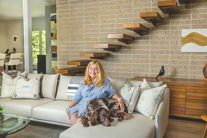
Carter installed birch floors downstairs. But sunlight streaming in through the original windows turned the wood yellow. After installing UV-protected glass panes, she switched the floors to English oak. “They are easy to clean,” she says, which is important with her big dog Harry.
She replaced the steps on the floating staircase—another eye-catching feature— because they had been “carpeted and re-carpeted so many times the nail holes were impossible to repair,” but kept the original steel supports.
“Thank goodness no one painted the stone work” behind the staircase, Carter says. “That would have been a tragic mistake.” The home’s smooth walls are painted various shades of gray, “which I think are calming.”
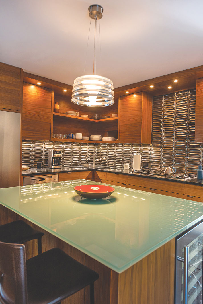
Carter gutted the galley kitchen and expanded the footprint by turning a full bath into a powder room. “There is no bedroom downstairs, so it didn’t make sense to have a double sink, shower, tub, the whole works. So I took space out of that bathroom to put into the kitchen.”
Kitchen cabinets and open shelving are a rich walnut. Countertops are black soapstone. Two square stainless-steel sinks—placed corner to corner—make an artistic statement. The island is topped with inch-thick glass. Backsplash tiles are by Heath Ceramics of Sausalito. The slate-like stone floors in the kitchen, powder room and hallway are by Blue Mountain.
Technically, the house has three bedrooms. Two guest bedrooms were divided by a plastic accordion door. “That was typical of the mid-century style,” explains Carter, who now enjoys one large open space—sans divider—as a sitting room-guest bedroom.
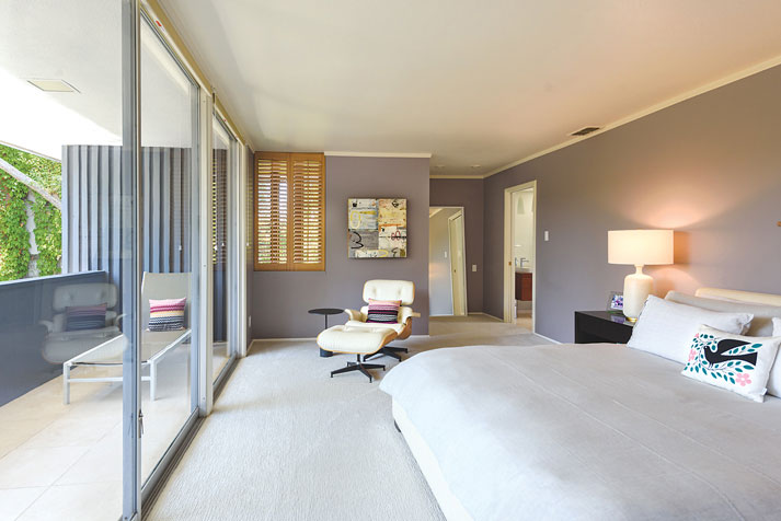
The generous master bedroom showcases another wall of windows with a sliding glass door to an outdoor balcony. “I love waking up to the light in the morning,” Carter says.
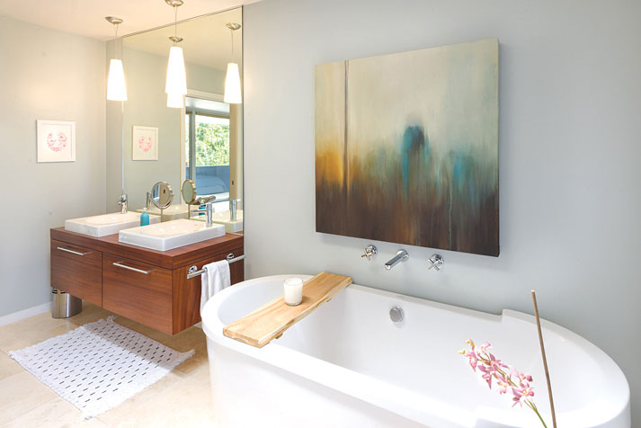
The formerly “hideous” master bathroom now features teak cabinets, side-by-side square vessel sinks and a freestanding soaking tub. The shower’s river rock floor compliments white subway tile walls.
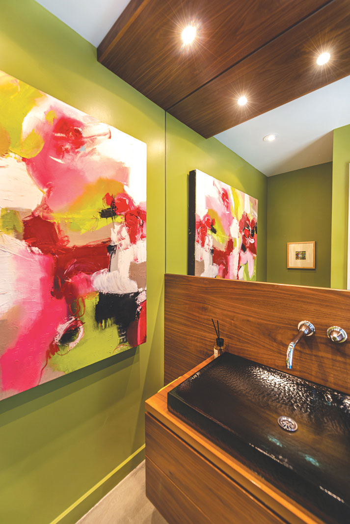
The powder room has a black rectangle vessel sink nestled into a floating walnut cabinet. In the guest bath, “the sink, toilet and bathtub were all orange—and not in a good way,” Carter says. In their place are a large modern shower, wall-hung toilet and quartz countertops. The original cabinets were repainted. Carter kept the “fun stuff,” such as the cool chrome toilet paper holder and trash insert on the side of the cabinet, which are part of the home’s original charm.
The homeowner is quick to compliment contractor Ron Simms, “who cleaned up every single night before they left,” Carter says. “He had a whiteboard that said this is what we did today. This is what we’re doing tomorrow.”
Carter also enlisted the help of designer Macrina Rodriguez. “You have to work with someone who is a good listener. You have to find the right person who understands your vision.”
To recommend a home or garden for Open House, contact Cathryn Rakich at crakich@surewest.net. Follow us on Facebook, Twitter and Instagram: @insidesacramento.


