As Marika and Scott Rose planned for their two daughters to move onto college and beyond, the couple anticipated some changes for their empty nest.
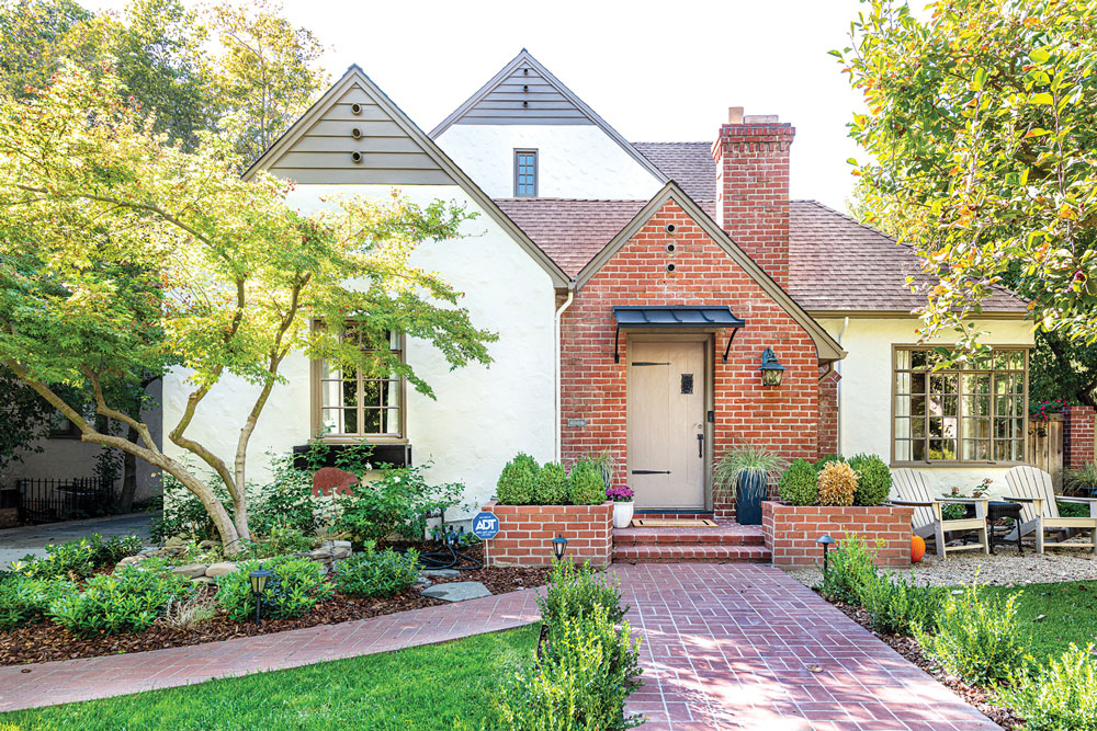
The Roses purchased the classic brick and stucco 1937 Tudor-style home in Land Park 25 years ago to start their family.
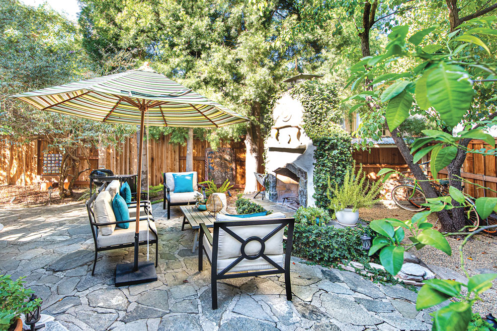
As the family grew and finances allowed, the couple expanded the home on several occasions, adding a family room off the kitchen, and then a second story with two bedrooms and bathrooms, and an upstairs laundry room. When the girls were teens, they added a beautiful side patio with an outdoor fireplace and generous seating areas for family and guests.
About five years ago, they hired designer Elizabeth Lake to help further remodel and refine the home for their evolving lifestyle. “Elizabeth helped us tie it all together by rearranging, repurposing and adding some new pieces,” Marika says.
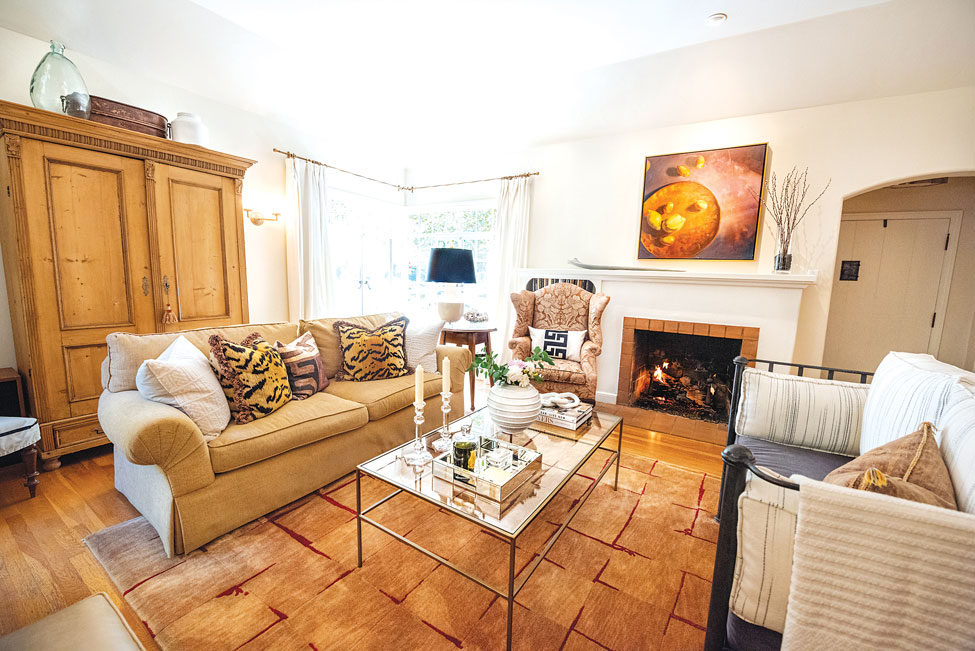
Lake brought a fresh viewpoint. “After 25 years you stop seeing things that have stayed in the same place,” Marika says. The home design now is beautifully appointed with art, accessories and a dramatic sense of scale.
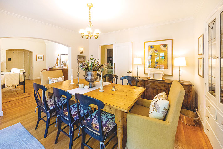
“My mother was an avid antique hunter and many things in our home came from her collections of antique and vintage pieces,” Marika says. “Every weekend she’d take me to see what was up for sale at the Butterfield & Butterfield auction house in San Francisco.”
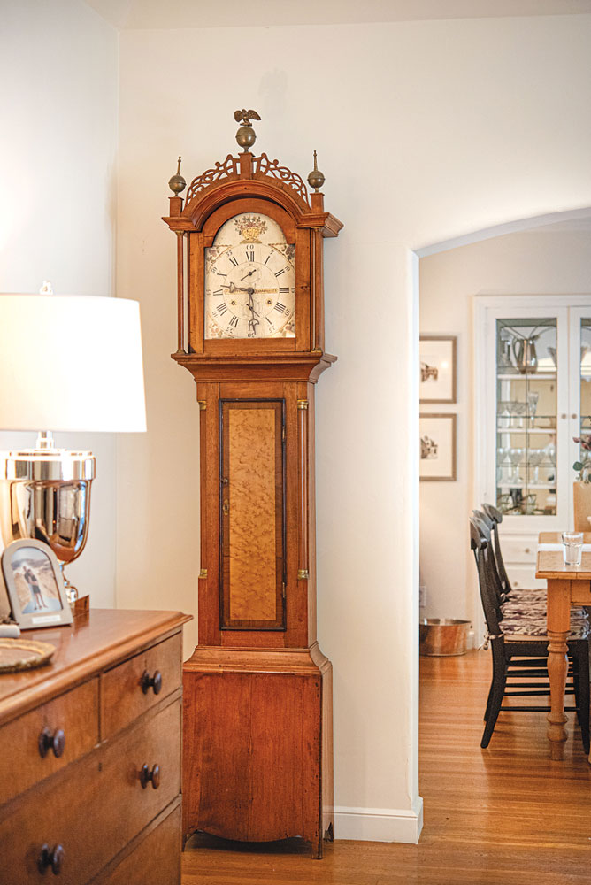
The first floor features a mix of traditional and new pieces, including a grandfather clock from her grandmother’s home. “It doesn’t work at this time, but the craftsmanship of the case is wonderful,” Marika says. The art is eclectic and highlights local artists, some famous pieces the Roses inherited, and some items from trips abroad.
“I like to be able to layer things, like the special painting we got when my husband’s parents passed away,” Marika says. Walking through the home the patina that ties together the furniture, art and accessories is subtle and gracious.
It’s hard to believe that what was once a tired and worn three-bedroom, one-bath, one-story home with original fixtures is now a modern family home with layers of history.
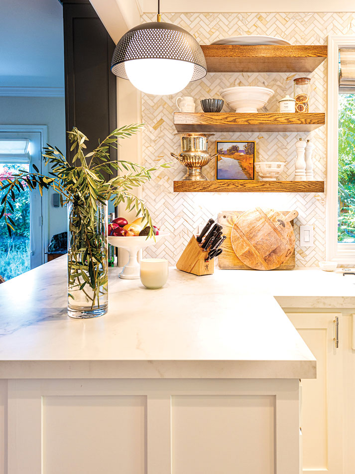
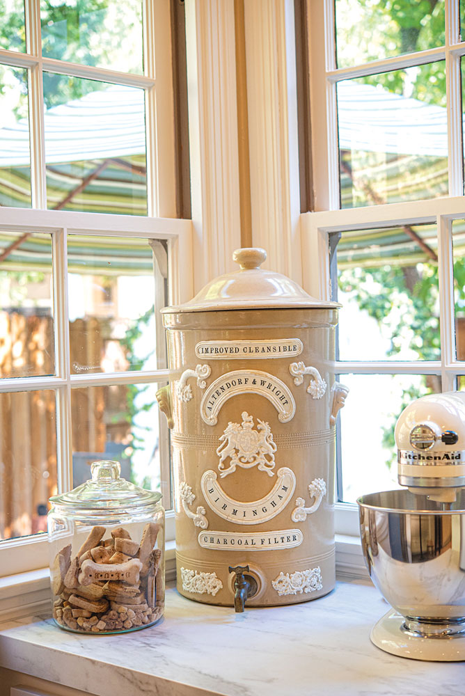
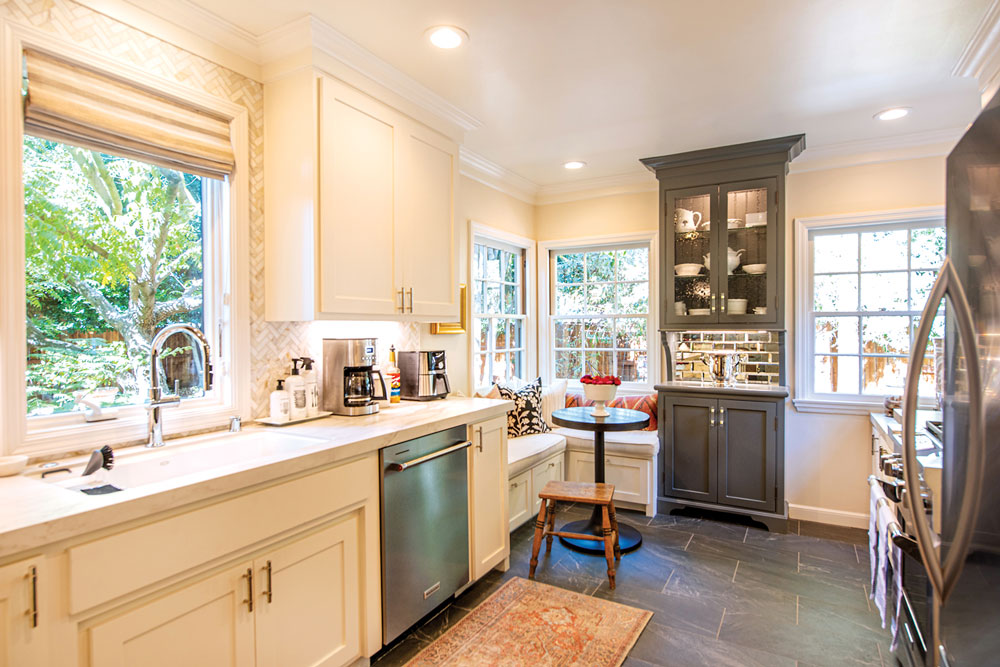
The kitchen remodel introduced traditional white cabinets and counters accented with a herringbone marble mosaic backsplash. The visual centerpiece is a ceiling-height glass-front display cabinet finished in dark gray paint, with a shimmery mirrored subway tile backsplash. The gray paint coordinates with the large scale dark slate floor tiles. A small eat-in nook fits comfortably in a corner window with comfy pillows.
A small counter peninsula features gray wicker French bistro stools.
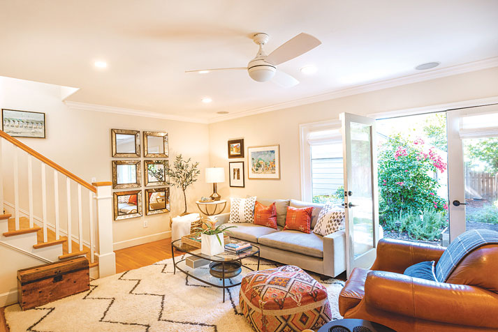
The open family room is casual with a built-in bookcase, a large wool Moroccan tribal rug, leather furniture and an ottoman upholstered in a Turkish kilim rug.
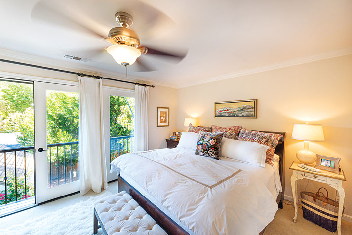
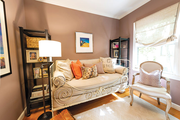
Upstairs, the master bedroom is light and airy using white and cream tones in multiple textures. The room has two sets of French doors with a gorgeous view of backyard treetops. The second bedroom upstairs and the other two downstairs are decorated in a chic casual style with vintage items supplying history and detail.
The upstairs hallway has a tiny library that contains their daughters’ favorite childhood books. “They still love to look at them when they return home,” Marika says.
“Our favorite part of this home is the history that infuses it. From our early lives together to raising our children to things that we inherited from older family members,” Marika says. “It all adds to the patina that is our family life.”
Cecily Hastings can be reached at publisher@insidepublications.com. To recommend a home or garden, contact editor@insidepublications.com. Follow us on Facebook and Instagram: @insidesacramento.


